All about the skin around the eyes and “drooping” eyelids
04/04/2025

10/01/2022
Corporate signage refers to the visual system that uses symbols or signs to direct, guide and organise people within a space. A signage system comes to fruition as a set of physical items and plays a very important role in a user’s experience during their stay at an organisation's facilities. The refurbishment work to our emblematic building includes the incorporation of new signage to improve the customer service provided to our users during their visit.
With the renovation to our signage, we're seeking to facilitate a clear and unequivocal interpretation of its directions, as well as to unify all the posters present on our premises. Its design has been produced in line with our corporate image to strengthen our brand identity.
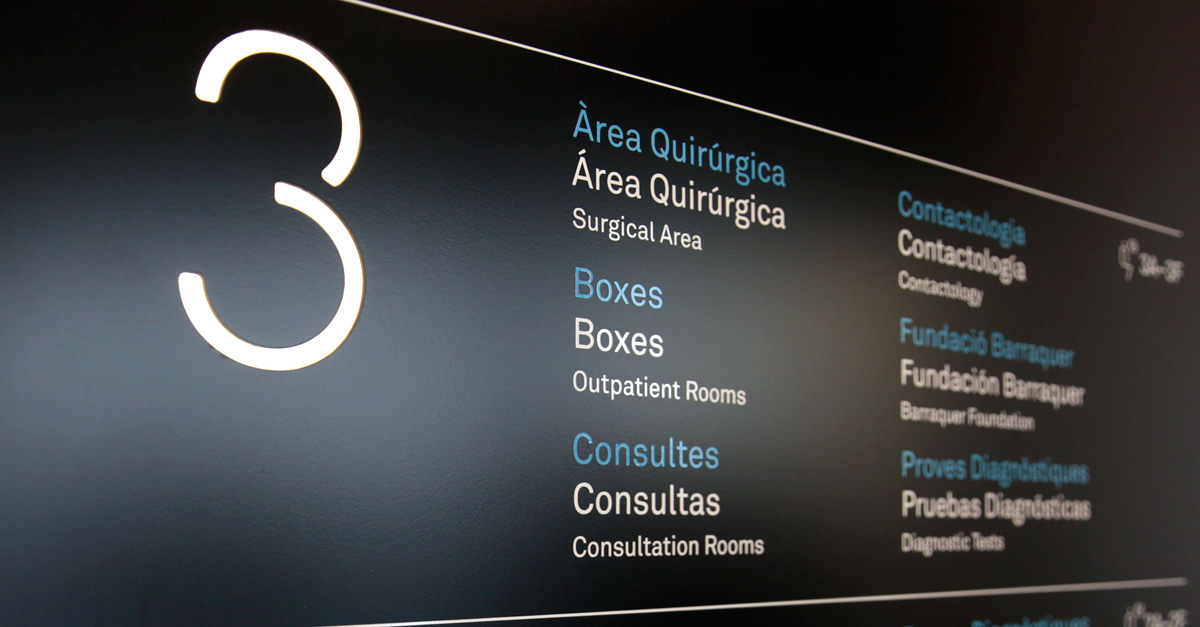
In the design of the Centre’s new signage we have increased the presence of signs for the most frequently used and most complex services. To improve the user’s orientation, numbers have been added to the room and office name along with the doctor’s name or the test to be undertaken in the room in question. To identify non-care areas and direct users to them, pictograms have been incorporated. Furthermore, the languages used on the different items in the Centre have been homogenised. All the signs now have three languages: Catalan, Spanish and English.
The new signage system incorporates different types of signs according to the role they play for the users. The directory gives them an overview of the space and the services provided. The positional signs help them to locate certain areas or spaces. The directional signs point them to a place where routes intersect. Finally, the regulatory signs show them the restrictions or prohibitions in place in certain areas of the Centre.
The design of the different elements comprising the signage has been carried out in accordance with a common morphology, in which the colours black and red stand out for the background and font respectively, as well as rounded shapes, aspects that are reminiscent of the Centre’s own aesthetics. The placement of the new signs has also led us to revise their position and detect spaces that would give them greater visibility. Good placement of the items along with aesthetic coherence helps to bring continuity to the whole route a user takes.